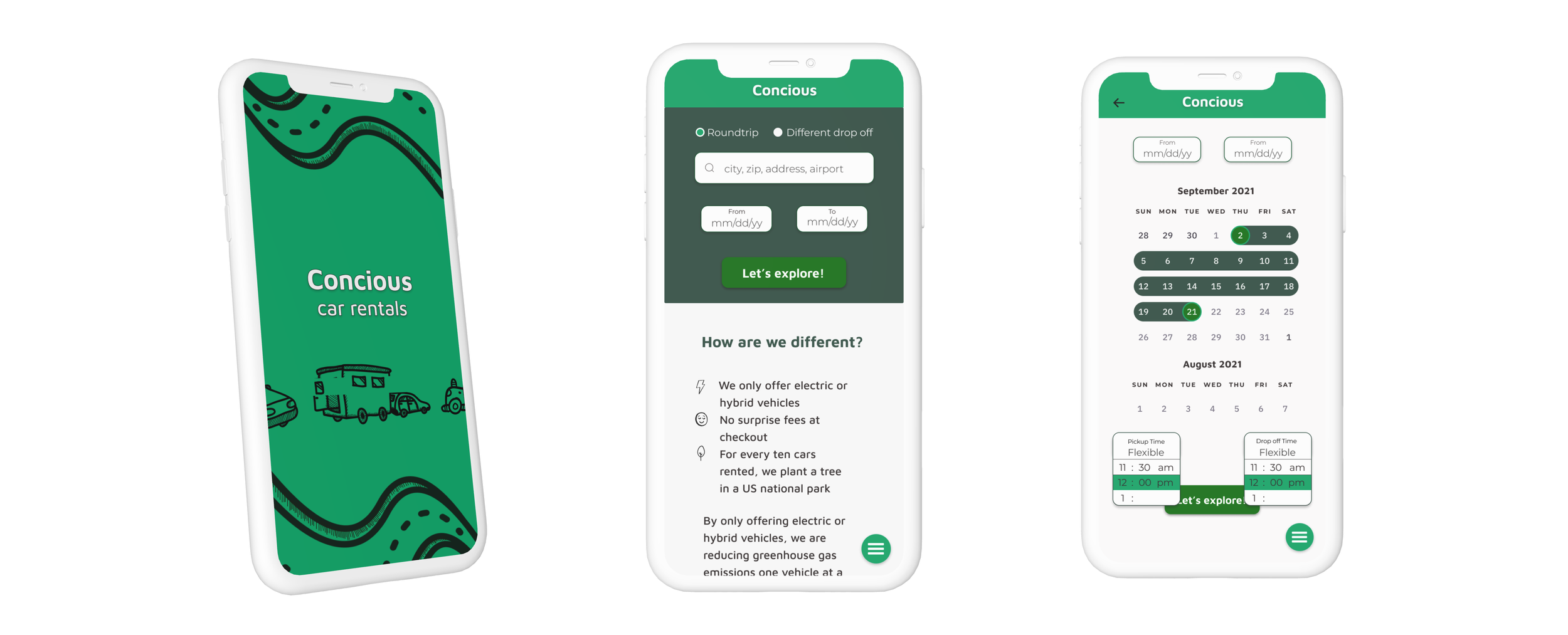
Conscious Car Rentals
A straightforward, intuitive app that enables environmentally conscious individuals to book an eco-friendly hybrid or electric car—without any surprise fees.

>> Why do we need something like that?
Going on vacation is fun, but the time and money associated with booking transportation are not…
Customers don’t often look forward to the process of booking a car, since it feels more like a task than something pleasurable. But what if everything were quick, upfront, and guilt-free?
>> That would be nice… tell me more.
Case Study
Product Vision
My goal was to create an iOS app that allows users to book a car in an easy, intuitive way. The short-term goal: create a booking flow for an app that prospects want to use. The long-term goal: become the go-to app for users looking to book hybrid/electric cars.
In order to differentiate my product from existing car rental apps, my business plan tested the hypothesis that an app featuring solely hybrid and electric cars would be valuable to a target audience of users who are environmentally conscious.
Discovered User Problem
Car rentals typically last 30 days or less (IBISWorld), but the booking process is onerous. It’s difficult for users to find the best value for their dollar, and additional fees can surface at checkout. Lengthy forms that must be filled out are an additional pain point. Users are more likely to follow through with booking a car if the process is simplified and fees are included up front.
Outcome
A simplified mobile application where eco-conscious individuals can easily and intuitively book a car.
>> What makes you think this will work?
Let’s break it down.
Process Overview
Project plan and responsibilities
Design Process
Research: research plan, competitive analysis, heuristic evaluation, survey, usability testing, empathy map
Analysis: affinity diagram, customer journey map, flow diagram
Design: sketched mockups, user flow, responsive UI
Prototype & Test: high fidelity prototype, usability testing
Phase 1: Research
Survey
My first method was a survey, distributed to users across the US and Europe who had previously rented a car. I focused on non-leading, open-ended, and Likert scale questions to uncover any patterns users may have when booking a car.
Data from 14 responses indicated that price is one of the most important factors while booking a car, with the majority of participants confirming they compare prices on several apps when renting a car, and 64% of users stating price is “very important,” ranking higher than other factors, such as short term availability, the brand of car, and pickup/drop-off location.
Hypothesis validation feat #1: The majority of respondents were impartial to existing apps on the market, with 63% claiming they didn't have a preferred car rental website/app. This indicates they are open to trying something new.
“Last time I rented a car I used a website to price match but I wasn’t successful because prices weren’t readily available.”
Competitive Analysis
I moved on to competitive analysis, where I conducted market research, scrubbed “best of” lists, and read a dizzying amount of app store reviews to determine my top three direct competitors and one indirect (Bird, an app for renting scooters) in the market.
Since I was tasked with creating a “happy path,” aka the main flow a user takes to complete an end-to-end booking, I evaluated that process on competitive apps, aiming to maintain objectivity while assessing positive and negative aspects of each page. I then created a spreadsheet where I measured how each competitor ranked among the 10 top design heuristics (more about those heuristics here).
>> How did the competitors stack up?
Turo ranked the highest in terms of coherently enabling the user to select exactly where they want to book their car, for how much, and when. Overall, the greatest negative experiences in the booking process centered around the additional and sometimes unclear fees that appeared during the last stage of the process.
Hypothesis validation feat #2: While some apps had the ability to filter cars by hybrid or electric, there were no top-ranking apps specifically designed for that market.
>> Nice, but I think we’re going to need some more validation than that.
Heuristic competitior evaluation
Usability Testing
I reviewed two existing usability tests courtesy of the UX Design Institute and conducted one of my own, drafting a script that captured users’ past car rental behavior and then tasked them to book a car on two leading apps in the industry. My goal was to uncover aspects that contribute to a seamless and easy or messy and complicated booking process.
The usability tests continued to showcase frustration with hidden fees. I was surprised to discover that users felt discouraged and wanted to quit using the app once it wasn’t providing clear feedback on why certain inputs weren’t working.
Hypothesis validation #3: Two of the users expressed interest in filtering cars by hybrid/electric to save on gas and expend less fuel.
Phase 2: Analysis
Affinity Diagram
I jotted down all of my findings from my survey, usability tests, and competitive analysis onto Post-it notes and sorted them with my developer friend (yes, that’s right, I am experienced at collaborating with developers) into categories that corresponded to phases of the car rental booking process.
I further divided those categories into subcategories and tagged them as positive, neutral, or negative experiences, which helped me easily identify pain points and potential areas of growth for my customer journey map (CJM). Before jumping into the CJM, I created an empathy map where I listed out what users were thinking, doing, saying, and feeling to better understand the dissonance between their actions and words.
Flow Diagram
The steps outlined in my CJM informed my flow diagram, which was representative of the user’s happy path. I found it helpful to once again articulate the context of who my user is and what they are doing. I mapped out the flow according to the statement, “as a (who) vacationer, I want to (what) easily book a car, (when) before my trip.” Defining the problem for the 1,000th time helped me stay accountable to my end goal of making an intuitive, easy-to-use app. I learned how to refine the amount of information on a given screen state by visualizing how the necessary components of each page flow.
Phase 3: Design
Sketched Mockups
Before designing the digital mockups, I sketched the wireframes by hand to ensure I could effectively iterate. I consulted my flow diagram and CJM to mentally visualize page states. I added color to draw attention to certain buttons and included in-line annotations to contextualize buttons, flows, and actions. After a good night’s sleep, I decided to break down some pages that were combined in my flow diagram so as to not overpopulate certain states. Then, it was design time.
Low-Fidelity Wireframes
Approaching from a black-and-white pictureless perspective allowed me to focus on the layout and completing all the screen states before getting caught up in details, such as font, iconography, and colors. I’m glad I took that approach because, in an unanticipated turn of events, I struggled the most at selecting colors (shout out to Figma’s saved components feature though, you’re the MVP).
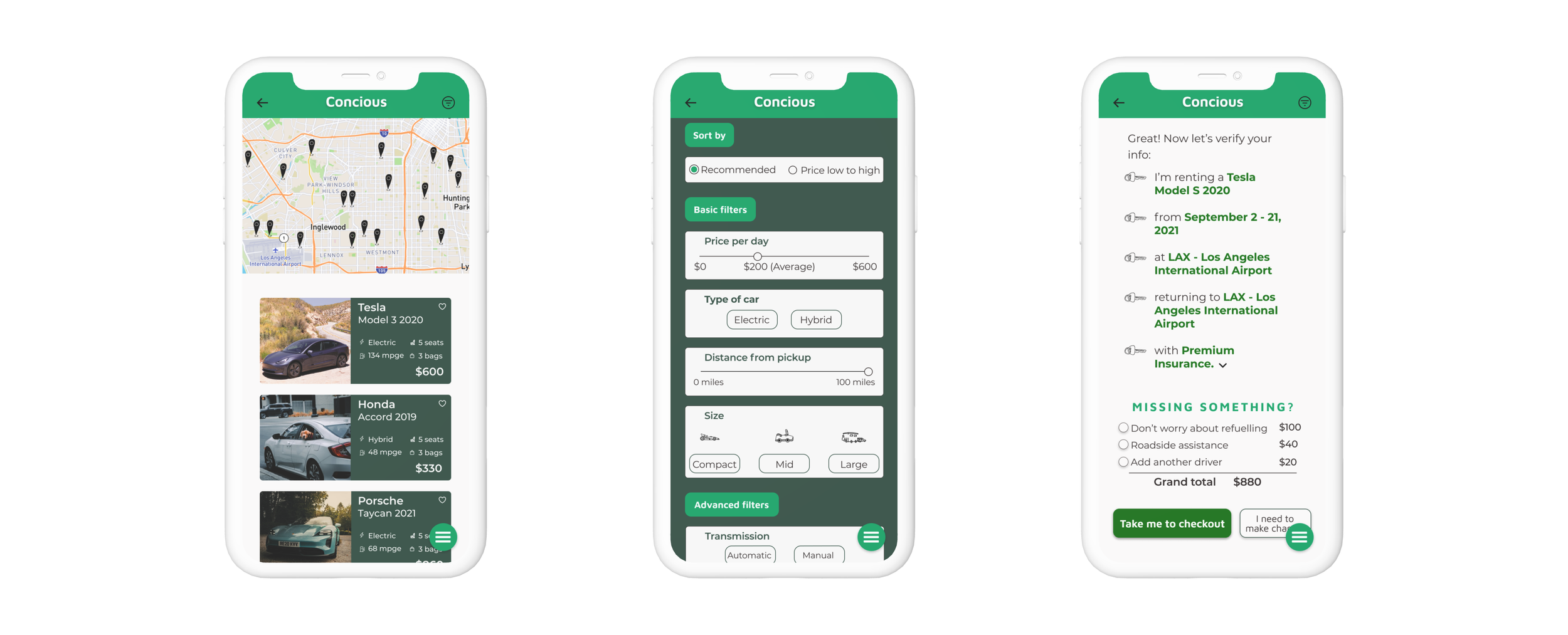
High-Fidelity Wireframes
I experimented with colors and text until the car app felt right, unique to my brand, and trustworthy. Then it was time to connect the dots, literally, for a working prototype.
Phase 3: Prototype & Test
Usability Testing
>> Again?!
It’s the key ingredient to UX, after all. I conducted one in-person usability test on my prototype. My subject was an architect who’s lived in New York City, London, and Dubai, and has rented a car in the past. She confirmed that she’ll likely book more cars in the future.
The most important aspect I wanted to validate was ensuring the user could easily book a car without confusion. The user was not surprised by any features but brought valuable insight to certain components. For example, she stated that she would not trust an app with so few photos of the car and thought she could click the features displayed on the car information page since they were inside circles. As a result, I added more photos of the car and removed the button-like features.
Overall, the user said the experience was positive, stating that “having fewer spaces to explore or click [and] displaying everything concisely in just one space helped me comprehend the process easily.”


Outcomes
Conscious Car Rental’s simplified booking process aligns with its goal of being an intuitive, easy-to-use car rental app. Further development would include PR support for broadcast and article placement in addition to a marketing campaign targeted at eco-conscious consumers.
I discovered that people who book cars are often frustrated by hidden fees and complicated processes, so Conscious Car Rentals is a distinctive opportunity to book a car with a company that is trustworthy, simple, and upfront. The user testing and research confirmed there’s interest in eco-friendly cars, so I’m confident that Conscious Car Rentals has a unique market value proposition that can succeed if marketing and PR campaigns are successful in spreading the word.
In the next iteration, I’ll create a path for users who want to customize their booking even more.


