Rainforest Exchange
A nonprofit that allows individuals to invest in the solutions of Indigenous Peoples and Rainforest Communities to help curb the triple threat of climate, biodiversity and social injustices.
If we want a livable future for the people, plants, and animals on our planet, we must implement climate solutions now. There’s thousands of technological inventions focused on solving the climate crisis, but the cost-effective, ethical solutions that have existed for thousands of years are often overlooked.
Problem
Despite the time and effort put into creating Rainforest Exchange’s web app, its projected GenZ audience wasn’t signing up or donating.
Health in Harmony’s model of distributing investments from individuals around the world to Indigenous Peoples and Rainforest Communities is a proven, award-winning model. When the company launched their app/website Rainforest Exchange, they weren’t receiving enough traffic, yet alone donations.
Upon conducting usability tests and an internal website audit, it was apparent that the company’s mission and strategy was unclear. Additionally, the nonprofit had new long-term strategies in mind, including creating a hub for businesses and Communities to get involved, and integrating Metaverse technology for a unique experience. This meant adding much more information, however, because the app and website were build on a mirror-server, the website needed to be redesigned so as to not compromise the app with content-overload.
Product Vision
My goal was to redesign Rainforest Exchange’s existing website so it serves a unique purpose from the app while accommodating additional target audiences.
The short-term goal: create a transparent website that builds trust amongst users, and Rainforest Communities, encouraging donations and engagement. The long-term goal: encourage users to download the app for a more involved experience.
Outcome
An organized website where each target audience can accomplish their differing goals.
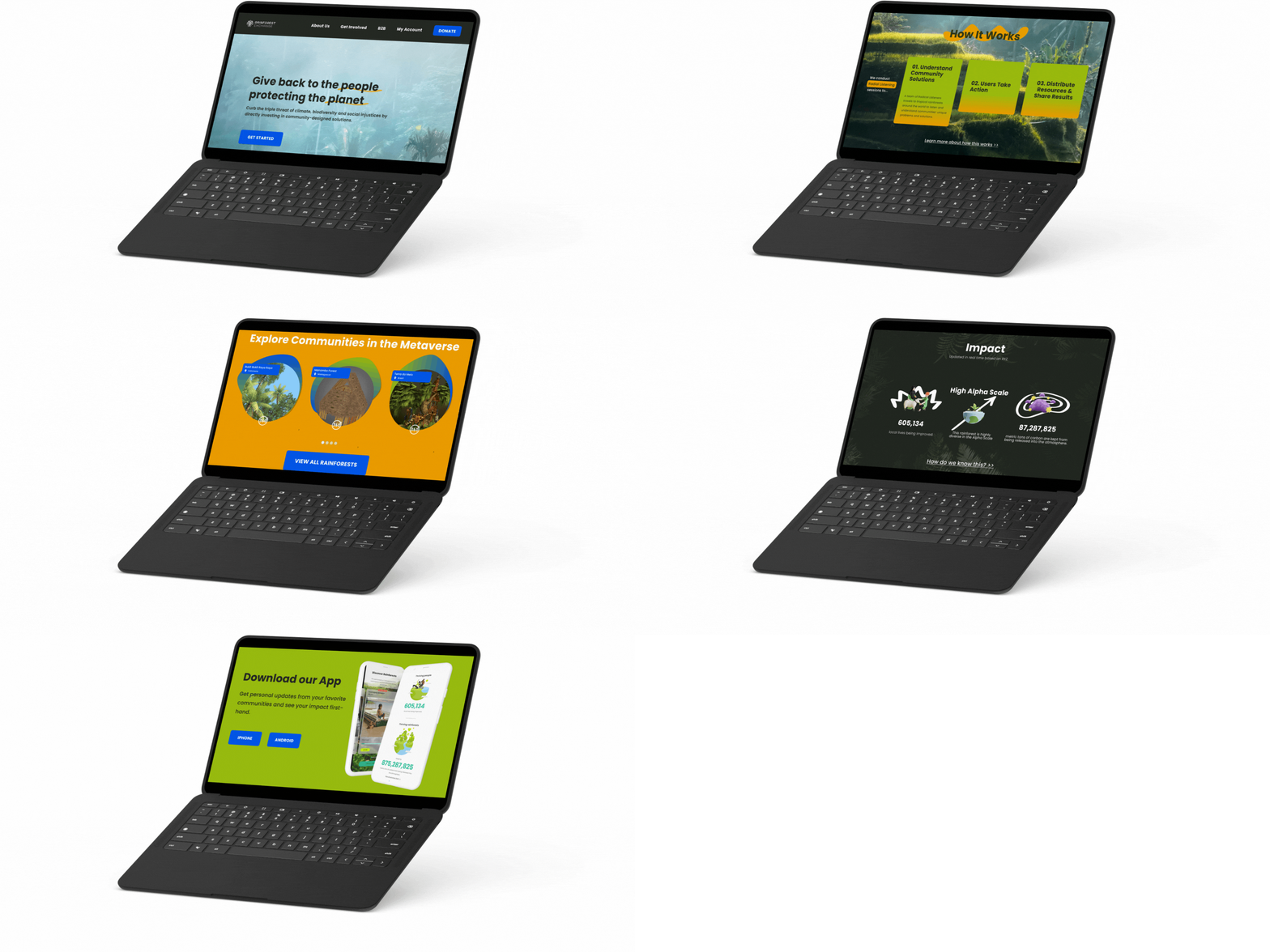
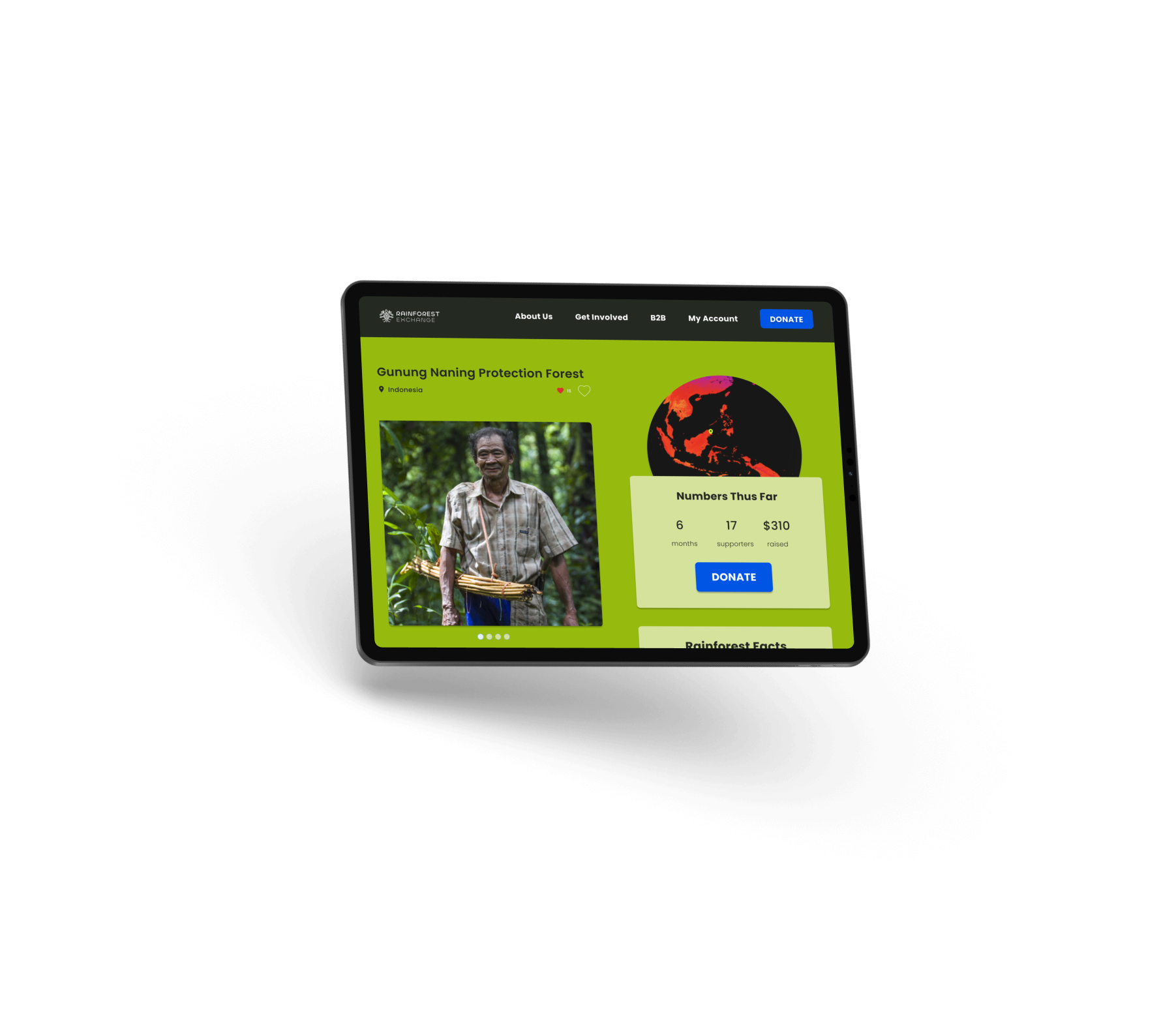
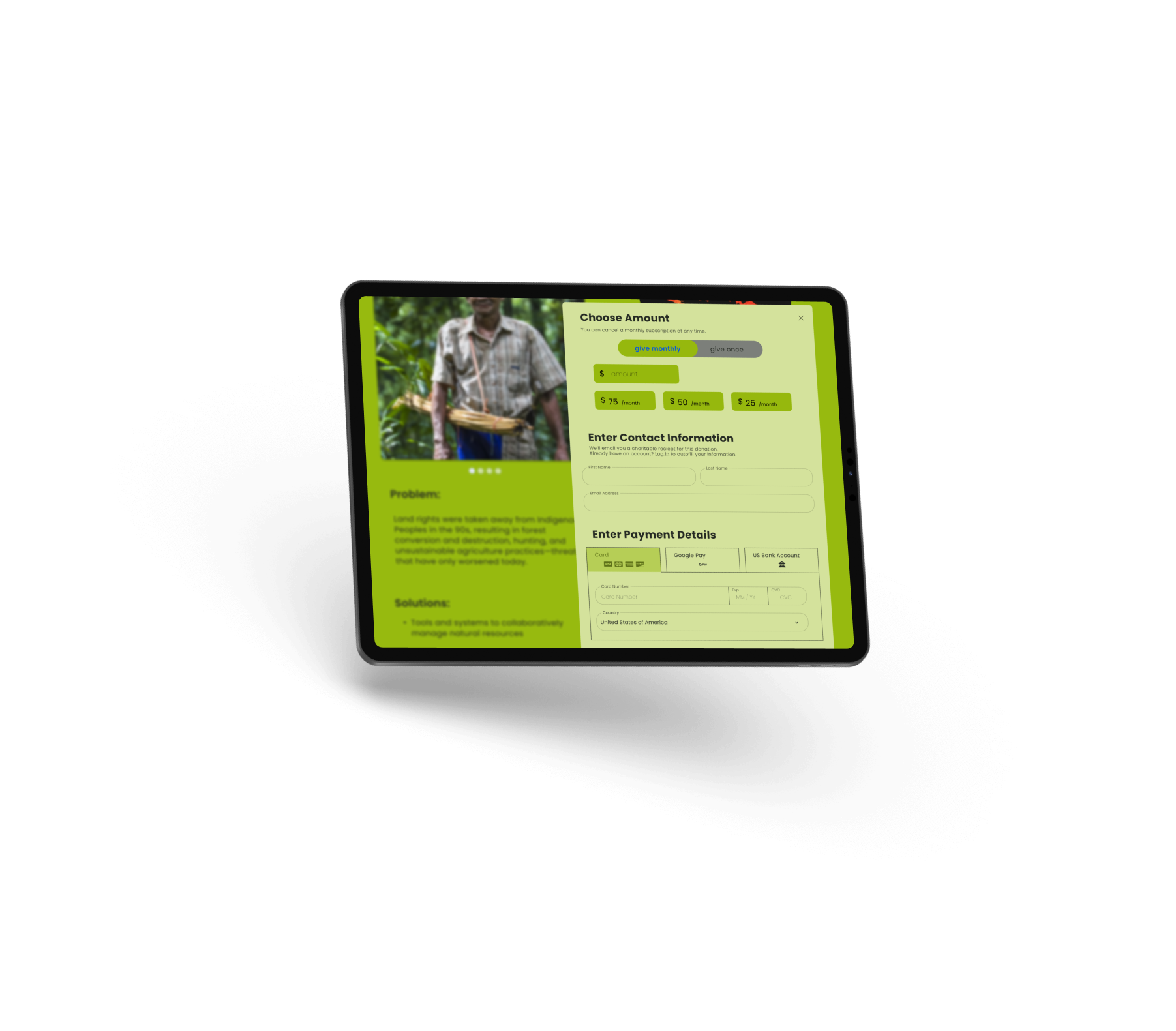
With a more concise homepage, limited CTAs, a new navigation bar, a one-step donation page, and more, Rainforest Exchange’s website offers a distinct, unique experience from its app counterpart.

Sneak peak of results: login page before
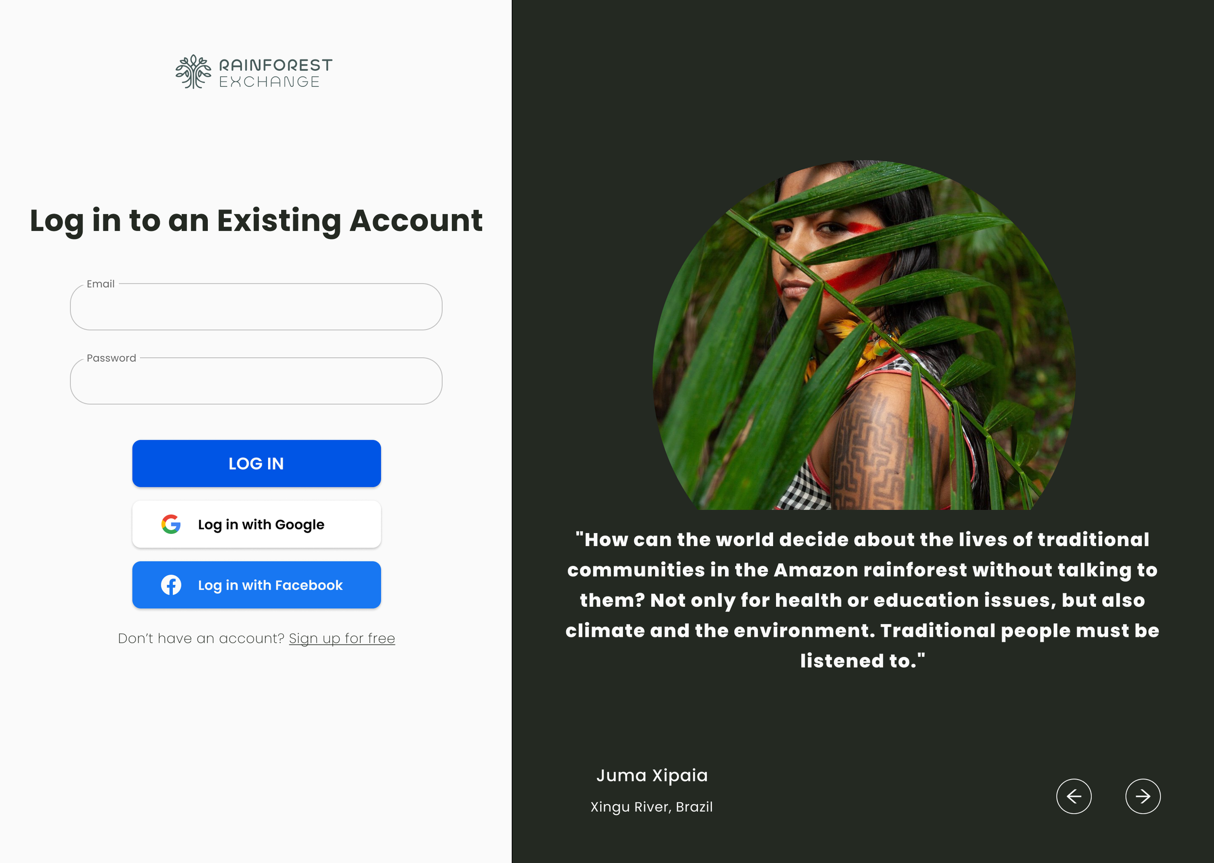
Sneak peak of results: Login page after
“Global citizens right now can donate and be a part of a climate action but this is distinctly active”
Process Overview
Project plan and responsibilities
Design Process
Research: research plan, usability testing, competitive analysis
Analysis: affinity diagram, customer journey map, information architecture, prioritizing CTAs, flow diagram
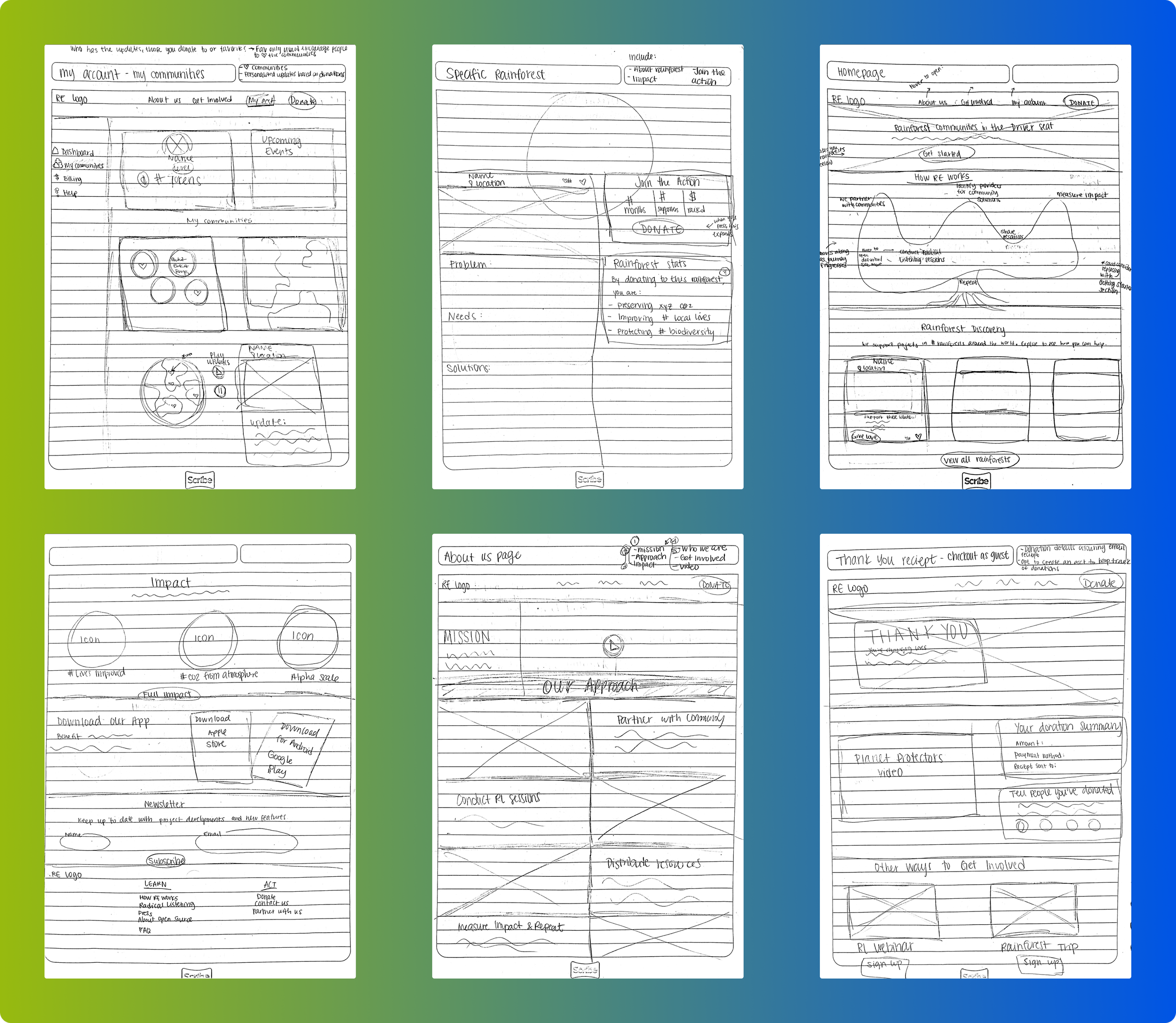
Design: revised personas, sketched mockups, user flow, high-fidelity wireframes
Future Steps: high fidelity prototype, usability testing
Usability testing is what got us here in the first place. A principal designer created the first version of the website and app, but once it was developed, they accepted a position at a new company. To better understand how users were receiving the app, I tasked three individuals to go through the phase of donating to a specific rainforest.
At the time, my objectives aligned more with understanding how users navigate through the app and how they feel about the language used.
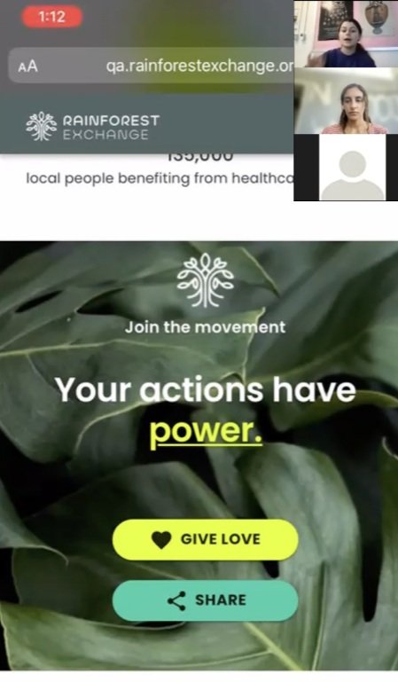
The tests uncovered that users were confused by the amount of CTA’s available within the app and didn’t understand the why behind certain sections or information.
This led my team member and I to question where we could include additional information to clarify how Rainforest Exchange works. We also considered the fact that since the app was the same as the website, there was no unique value proposition to have users download it.
That’s when we created a research plan for a website redesign. We listed the unknowns related to our problem—what kind of users are coming to our site, how many, who is donating, what are they missing? We came to the hypothesis that the website needed to better explain Rainforest Exchange’s mission and donation process through clear navigation. We also needed to test our current GenZ personas to see if that was the right audience.
The plan outlined methods of competitive analysis, survey, internal UX audit, affinity diagram, and customer journey map to understand how other nonprofits foster trust while encouraging donations. It called for social media A/B testing to see if other demographics were more likely to click-through to our website.
I examined 8 nonprofits and environmental companies for our competitive analysis to better understand how others structure their websites to showcase the mission, who they are, and how people can help. Key takeaway: to minimize our risk for donation turnaround, the process should happen on one page.
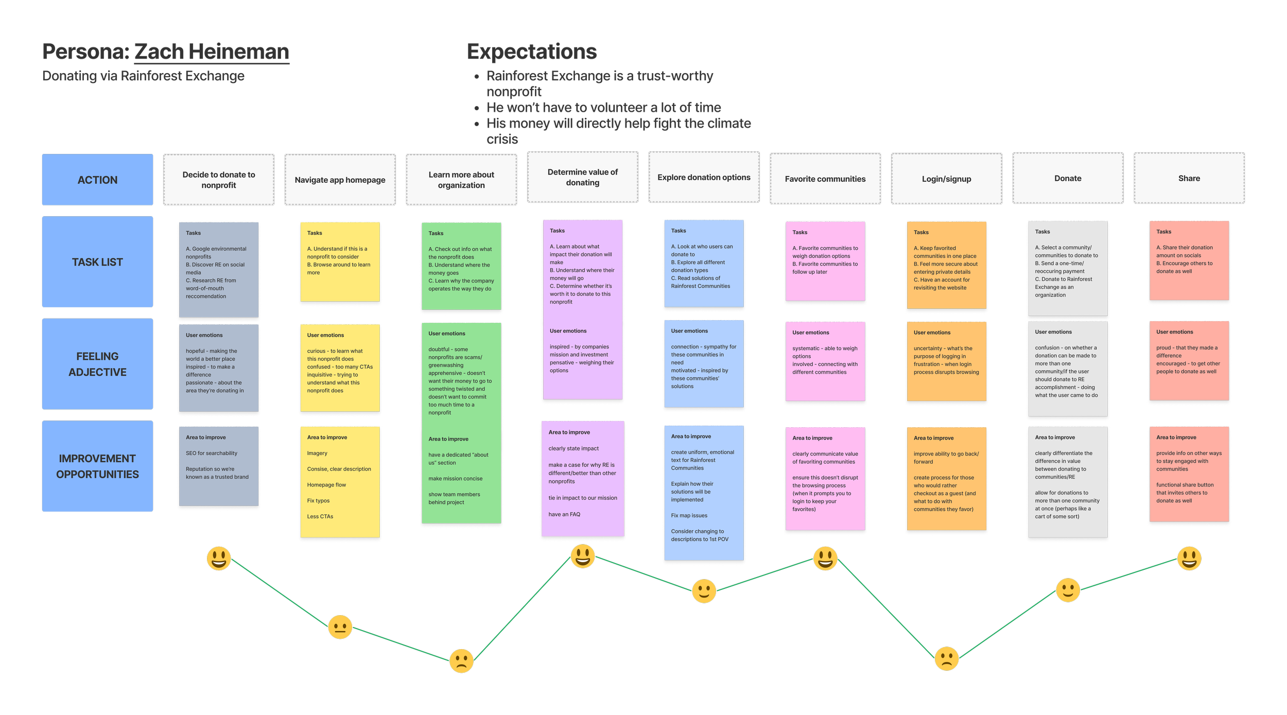
I compiled all responses from user testing, a typeform survey, and my UX audit to map out positive and negative experiences corresponding to navigation sections in an affinity diagram. This unveiled user’s top pain points—some related to navigation and content ie. the community section feeling text–heavy, or the color palette not being accessible. Others related to user needs, such as a need to feel as though they are engaging with communities and actually making an impact.
Social media A/B testing unveiled that younger Millennial males/older members of the GenZ age groups were the most likely to click through to our website. This, along with the fact that Rainforest Exchange wanted to add an opportunity for B2B and Community representatives to get involved, meant creating two new personas, Adrianna and Marcus. Zach, the persona the previous designer created still fit the bill, so I kept him in and used his archetype when creating the customer journey map, since he’s still a primary target for the donation process.
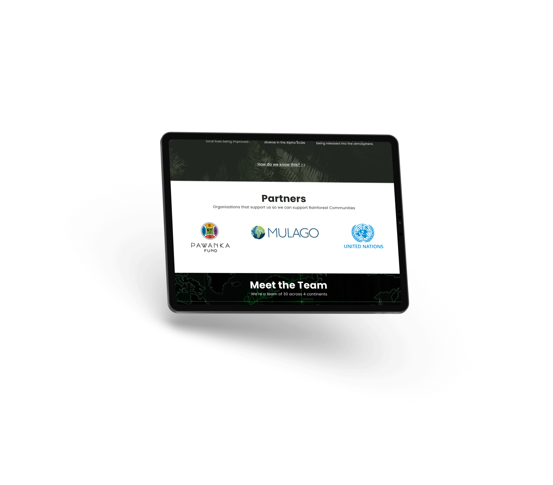
By clearly outlining the goals our users are looking to accomplish on each part of the journey in addition to their feelings, I was able to identify areas of improvement and further imagine how the structure of our website should flow. A few examples include that we should: show the team behind the project to build trust, ensure logging in doesn’t disrupt the donation process, and clearly define the difference in value between donating to communities/Rainforest Exchange.
Old Personas
New Personas revised to incorporate new website capabilities and age groups
The next step was redesigning the information architecture. Since the website mirrored the app, its navigation was a kebab menu that simply led to different sections on the homepage. This means the information architecture was a very vital step to the redesign—the website needed a clear navigation menu to build trust and encourage donations. Combining best practices from the competitive analysis, natural sections from the affinity diagram, and the customer journey map, I created overarching navigation bar sections that branched out into the content that should be displayed within each section.
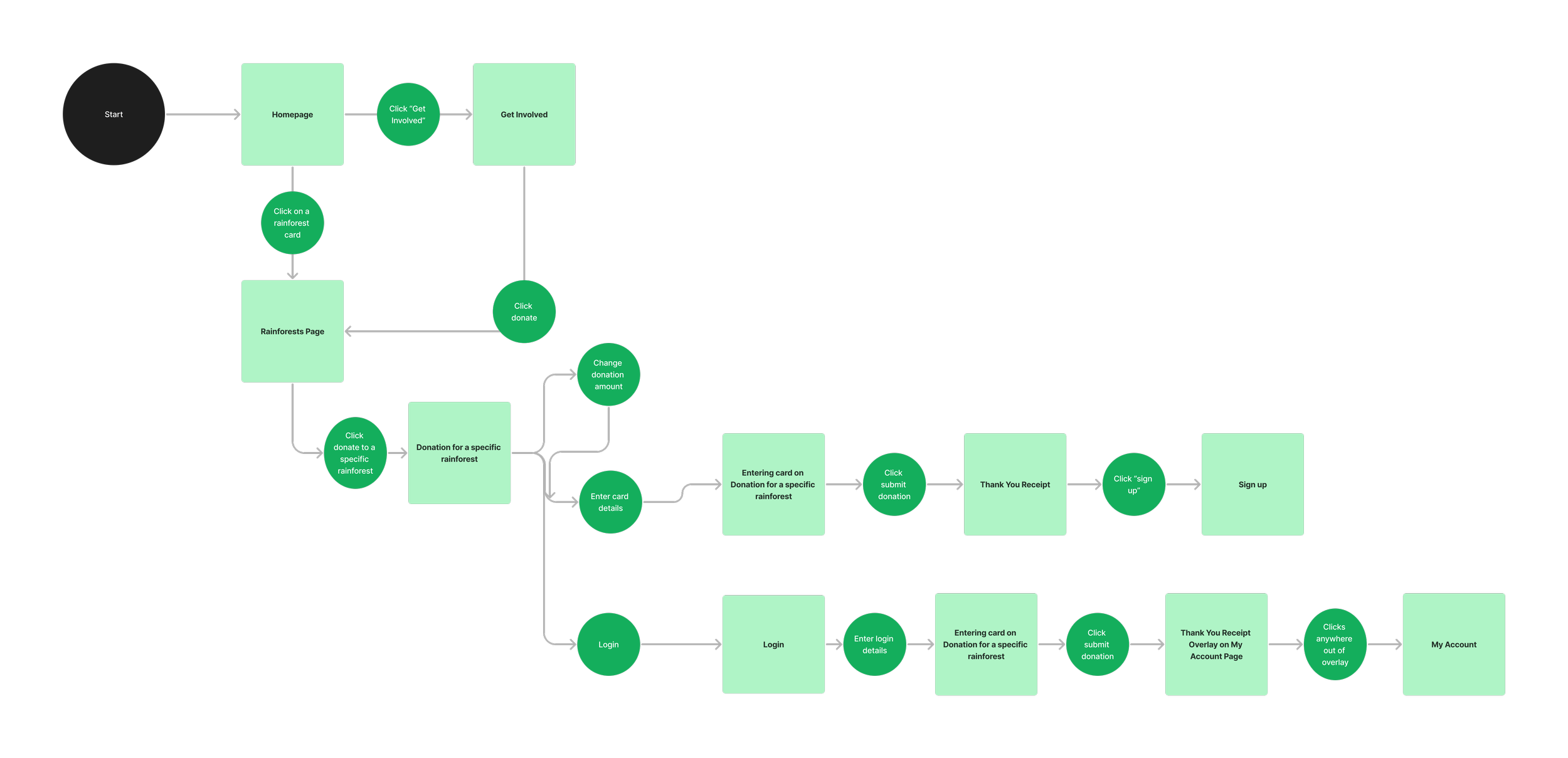
Now it was time for flow diagrams—a daunting task when accommodating three different audiences. Before I began tacking sticky notes to a wall like a madwoman (this came later, fear not), I outlined all possible call to actions (CTAs) for each of our personas. This proved very helpful in creating the flow diagrams, where I was able to prioritize the top three CTA of each audience member.
Next, it was time for the artist to stare at the blank canvas with anticipation. Not every component needed to be re-done, so I had to thoughtfully decide what to change as I revised each page to comply with the new structure, flow, and needs.
Insights
Challenges
There were several challenges along the way. The first was creating the research plan. I had originally conducted usability testing for a completely different purpose than a website redesign, but had to critically think about the root of the problem. What was the real reason Rainforest Exchange wasn’t receiving donations and app downloads? Once user testing and an UX audit revealed that users needed more information before donating, we were challenged with pitching the idea of a website redesign to the team of founders.
Start-ups often have differing goals and features they want added to their platforms from week to week. Designing a website that will eventually integrate with Metaverse technology one day was a curve-ball thrown at me during the research process. Nonetheless, I was able to adapt the UI to meet these needs without sacrificing the priorities of our target audiences.
Additionally, once I presented my first wireframes, there were edits I had to make to ensure the designs were meeting the expectations of my teammates. I iterated on certain decisions, from moving the newsletter signup to the footer so as to address our initial problem of not overwhelming users with too many CTAs, to adding a section for businesses and Community representatives to get involved, accommodating the additional members of the target audiences.
Key Learnings
Collaborating with startups is always a unique experience, working with vague instructions and pretty much all on my own. That said, it was interesting to collaborate with a brand strategist who provided a unique point of view on how we needed to adjust our messaging, mission, and overall website purpose. They were the one who recommended I map out all CTAs for each persona—something I’d never explicitly done before, but proved to be very useful.
Bridging the website’s current design with a potential future of a Metaverse integration provided new learnings on gamified components and how to balance the real world with virtual.
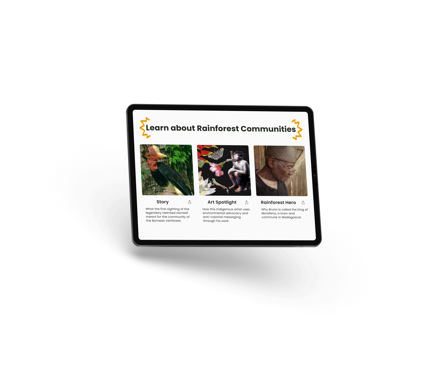
Lastly, it’s very interesting to work with a nonprofit that works hard to be anti-colonial in its work and language. That was a consideration I had to keep in mind throughout the whole redesign process, and changed how some pages were formatted, like the “Discover Rainforest” page which had originally contained filters specific to certain causes, which interfered with the idea of wholistic solutions for our environment.
Value of Design
Although this project was cut short due to budget issues, the redesign is essential to the future of Rainforest Exchange. Users are far less likely to download an app if it doesn’t offer an experience different to the website. Research on our target audience and nonprofits proved that transparency is key, meaning it’s essential for the “about us” page to contain clear information about the donation process, the company, where funds go, the impact, etc. A website without a concise navigation bar that caters to all these needs is obsolete.
The founders want the future of the platform to be high-tech and accessible to businesses and Communities, meaning they need dedicated sections where it’s clear that they can take action as well.
If time and budget allowed, I’d love to conduct usability testing on my working prototype with members of our three target audiences. Until then! ✌🏽
